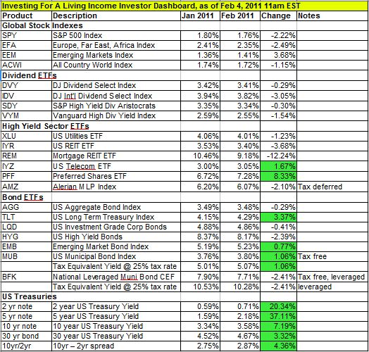
Last month I introduced my income investor dashboard that helps me keep tabs on the investment landscape from an income investor’s point of view. I’ve updated the dashboard as of this morning. Here it is:

I added this month’s updates to the table and calculated the change in yields from last month. A negative change in yield means prices went up and a positive change means the sector or product became less expensive. I approach this from a long term value investor’s point of view so those positive changes are highlighted in green. I also added a line below the tax free investments (munis) that calculates their tax equivalent yield for an investor in the 25% marginal tax bracket. There are many things to read into this table, I offer some of the items I noticed below.
For stock investments, only a few of the sectors declined in value. Preferred shares took the biggest hit, followed by emerging markets, and telecom stocks. In bonds there was quite a bit of action. US treasury rates rose across the board but the yield curve (1oyr minus 2 yr spread) became even steeper. Long term treasuries took the biggest hit followed by a slight hit to munis, but muni closed end funds rallied somewhat probably do to the dramatic sell off earlier. Foreign bonds also declined in value slightly. High yield investments still seem to be offering value but not as much as before. Higher treasury yields combined with higher prices for income investments means lower spreads which can be an indicator of values becoming extended.
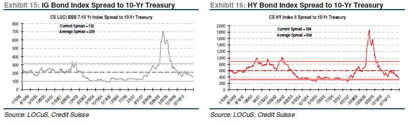
Ideally, to gauge relative value better, I would compare all the yields on these investments to the 10yr note benchmark and look at the current spreads and how they compare to past ones. I don’t have access to the all the data sources to do that except for a few of the sectors. Below are the spreads for investment grade bonds and high yield bonds.

As you can see both sectors are trading at higher values (lower spreads) than average with high yield bonds in particular looking pricey. Also, in the case of MLPs, where I keep my own data, they are trading at a spread of 2.49% compared to an average spread of 3.06%. The one sector that seems to be going in the other direction and offering higher spreads than history is municipal bonds, as I showed in an earlier post this week.
Well, that’s the update for this month. Let me know if anyone has other insights into this month’s changes.